The relationship between all the color is shown in a linear way. I like the idea that all the colors are put into something looks like a ribbon, and the in-between colors are shown in the folds of the ribbon. This idea makes the design makes a lot of sense for me. The ribbon also suggests that the colors go in a loop. The first loop is the base color and the second is where the real life photos are placed. I believe that it is a good way to make the comparison between the pure color and the photo’s. The way all the concepts including saturation, color temperature and contrasting hues are shown is that each of them has their own line made out of circles and each circle presents a color, I think that the consistency and minimalism of this representation very pleased the eyes. I believe that the typography is well-integrated, it is a simple font with different rotation and size depend on the the context it is describing. What I think that can make the diagram even better is coming up with some creative way to present the different type of colors, the color temperature or the complementary colors in the same infographic. At this moment, all the presentation are separated and a little simple. The strongest component for me is the way that all the colors is implemented into the ribbon loop, it just looks very logical and also artistic.
The color in my diagram is a little off but it will helps when click on the image to see it in new tab.
The relationship between primary, secondary, and tertiary colors in my diagram are linear. It goes in the way just like the color wheel and creates a loop. I mostly used the color of the photograph as the most saturated color, each picture presents the most basic shade combined with the saturation level bar to shows how the color can be different to the viewers. I have a bar for each color to show the saturation with contrast of shade and tint, for the temperature, I divided them into 2 ends with each end has a train saying what side of the spectrum they are. I was inspired by the basic color wheel and the examples that have more of a linear composition. I believe that the typography is well-integrated since they are mostly just simple fonts with all caps because I want to keep them in a minimal way.
I believe that the width of most of the letters are at a good level. They are wide, but it is their style. The only letter that I feel like it is not fit in is the capital Y, it looks a little too thin compares to others. Increasing the width of the capital K I believe will makes the overall more consistent. The boldness in this type face is significant, but I think it is the intention of the maker so they looks very harmonically in general.
The contrast in here are between neither cyan or red-violet with grey, and the division of the colors is very balanced. I personally like this choice of colors, it reminds me of the cyberpunk/synthwave which is very stylish. The small details of the glitching I believe is a good touch but it needs to emphasize to be more obvious since they are a little too small here.
The posture is straight upright. Although the letters are creatively designed, the straight posture is still recognizable which I think makes it a good design.
The letterspacing is at a good level. However, I believe that the the y and g need to get pulled down so that their descenders can be at the lower level.
On the whole, I think that the typeface is very legible when viewed in the pangram. They have a simplistic idea but not entirely, the contrast in colors makes them more complicated but in a good way. This makes it very interesting to look at.
The modular model consist of lines in an image of a pentagon with a five-wing-star in the middle. They fit together since they are all come from lines in the modular model. When I started with this modular model, I already know that it will be very challenging since the limit is very narrowed. For the capitals, I want to use the maximum height for all of them but I could not think of ways to make some of the letter with that height. For that reason, some of them only as high as from the base line to the orange line, they did not use the lines from the “cap” of the modular model (they are m, n, u, w, x, y and z). For the lower case, some of them look chaotic but they are the only ways I can think of to make them from the modular system. Especially the lower case k, it is the capital but with shorter length, I could not think of a way to make it look more like a lower case k. The h is a very good example that succeeded in this, the capital and lowercase are very distinctive and easy to recognize which one is which.
I would say this modular typeface is very unique and eccentric. I believe the most interesting thing about it is how they are all come from a very limited modular model. Because the modular system is a star, it may suitable for something related to astronomy.
I believe that similarity is one of the important aspect for my design, it is obvious where are all the letter come from, it makes them looks strange but in the same way. Another aspect is simplicity. The letters only consist of black lines but they are still readable and stylized in a unique way.
Ascenders has the same height, I did not rotate the letters that has ascenders because I like the style in that way. But for the descenders, they looks really strange if I keep them in the original position, so I rotated it to straighten them. Overall, The weight and contrast are the same since they are just black lines, but the width, posture and height especially with the lower case can be chaotic, however because of the limited modular system, I am happy to how it turns out at the end.
I specifically like this typeface since it is bold and big. It is stylish especially in the tails but also have some formality with that organized look. Besides the amount of time this project took me for adjusting the archons, the most challenging thing for me is making the connection between each segments look smooth. They looks a little broken sometimes. The flaws also more recognizable when I have a closer up view so I tried my best by zooming in and made it as smooth as I can. David Carson is my favorite designer. I like it when he point at the words and said that they do not look like anything they say. For him, typeface not only communicate through their text but also on how they present themselves through visualization. It was a very artistic way of thinking. I think the most relevant principles in this is design are Framing since they need to be uniformed with the same size and Rhythm & Balance with the design at the tails and the thickness between different letters match each other, this created the harmony in the whole alphabet.
Collection I Keep: Brainstorming Activity and World Map by Amani Edmondson
I believe that the hierarchy is established well. I can see that everything is in columns and rows although they are not perfect. But I think it is the intention of Amani as she wants it to be scattered and structured at the same time.
The variation of scale in here is on point, the name of the categories and what she thinks important is enlarged and bold, it helps drawing attention to the viewers to read the name of the groups first and then what inside the group later. In addition, I also believe that there is a rank of importance based on the size of the font and how standout they are which is very interesting if we take a closer look.
The placement I think is successfully executed with Amani’s intention, the position of texts is adjust based on their size. For that reason, although they are not put in perfect grids, they still do not look off as there is still some organization work in here. All the text is black except the “inspiration people” has a golden color and almost 3D stylized, I think this is a nice touch for the whole project working as a highlight point. For me I would think that Amani is a person who always look up to others while learning to try and perfect herself every day.
The composition is balance for me, not things seems off as they paint a full picture of Amani’s collection. I think neither symmetry nor asymmetry are applied in here because it never meant to be. The idea is to be a little bit chaotic to portray her thought.
The work does feels like a self-portrait for me. It mentions a lot of hobbies that they may have some deeper level of meaning if we get to know Amani better. For example, “Giraffe stuffed animals” is rather specific that she may have personal connection to some of the collection just like this one.
The overall design and organization of Amani web portfolio provide a clear presentation of this project as well as other work, the hierarchy of showing all of her work in class at the same time feels like pinning notes on the wall which is very unique and on point. Overall, I think Amani succeed in portraying herself in this project as it sends the right message it intended to.
The way I organize the collection is between the visible things and the invisible things. It might be hard to recognize but the visible group supposed to shape an opened eye and the invisible group supposed to shape a closed eye. My strategy is to put the collection together to shape the images of its own group. In addition, what I put on the iris is what I focused the most, interested the most at the moment.
I think that it is really fun to think about the collections that suit each categories, what challenging is that because I can not have actual shapes to get the images I want, I need to use words to do it which took me some time to do it right and it still very hard to recognize.
I learned about the type on path tool which is very convenient for typing following a specific curve. I realized that only the fonts, size and the rotation can be very powerful that they can convey a lot of meaning.
I believe my balance and rhythm are fairly harmonious, the style of both the eyes are the same and they balanced to each other in an asymmetrical way.
The words are dense that it created an even texture for the eyes, the texture for the name of categories are less dense but they help the users to read it first before looking at everything else. Overall, I believe the texture succeeded in what it try to communicate.
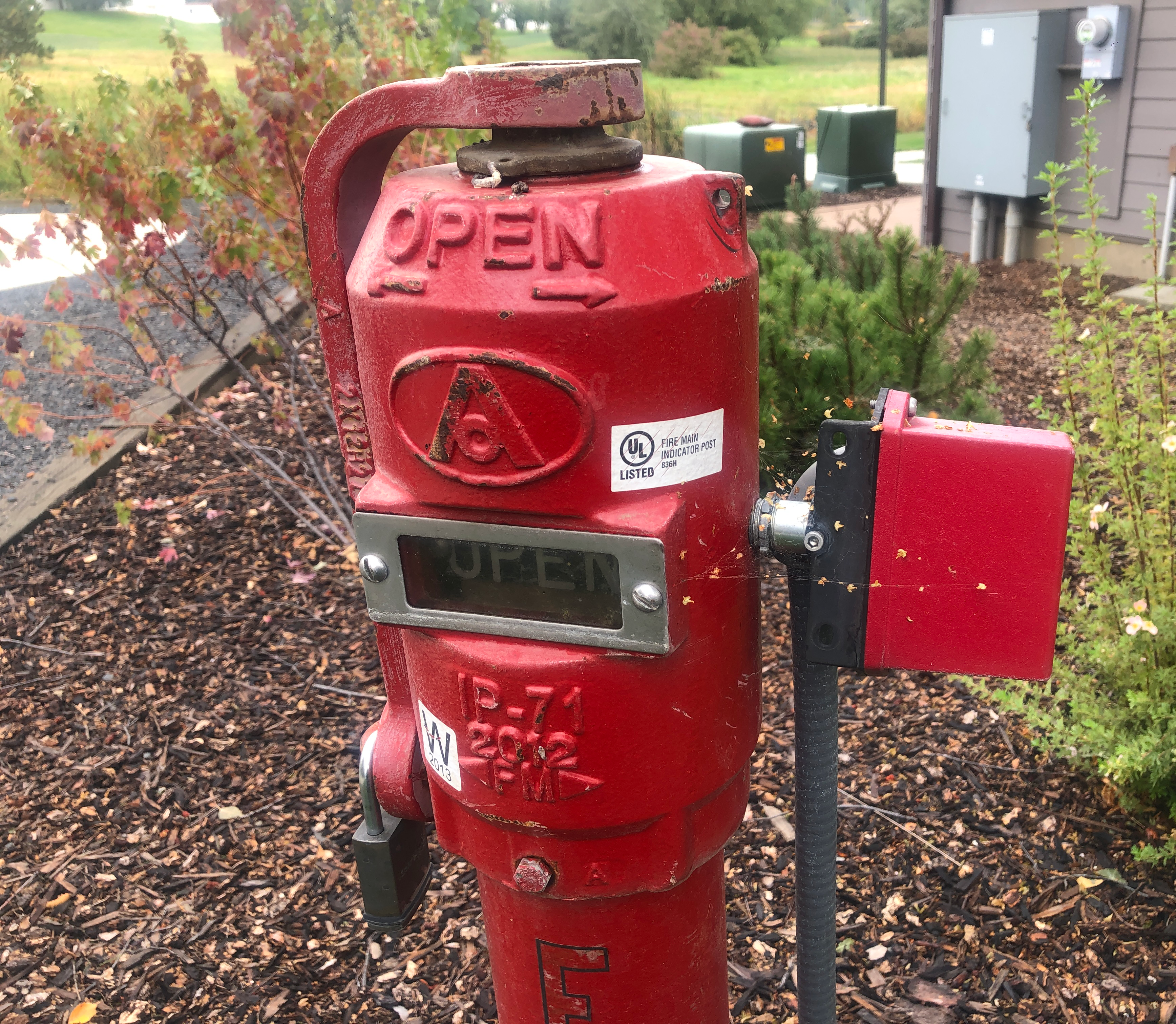
I chose this fire hydrant because I believe although it looks simple at the first glance, it actually the combination of a lot of small parts. The object can represent points, planes, lines and volume in a lot of ways together with its surrounding. This is unusual because this fire hydrant belongs to an apartment next to mine which is not a place I usually go to.
Photo Essay 1
1. The principle shown is point.
I believe the point is an insignificant fleck, the point can be the very small hole in the middle (point made with negative space), the small pieces of rocks, barks on the ground or the big circles on the fire hydrant which I can see 3 of them.
I think the camera framing really focus on the points in here, beside purposely took the picture that way, I also cropped it so the main character can be in focus even more.
The texture in this image is very diverse, we have the complicated, rough and pointy grass, the ground mixtures and the smooth texture of the fire hydrant.
2. The principle shown is plane.
Photo Essay 2
These planes shown best in the transparent screen cover the word “open”, the surfaces of the lock and the box on the right are also made of planes. The quality shown I believe is that they are skew and recede into space rather than parallel to the picture surface.
I intentionally focus on the planes, especially the screen in the middle which makes the frame let the audience know where to look at.
The texture is mostly smooth surface of the fire hydrant although the lock may feel a little bit rougher.
Photo Essay 3
3. The principle shown is line.
I can see a lot of lines in here. They are included the outline of the fire hydrant, the gray tube on the right, the lock, the letter E, the texture of fire hydrant and tube or it can also be the tree branches in the background. These are all positive mark, the lines made from outline and the branches are thin, but the whole fire hydrant and tube can also be considered as lines, they are so thick that it they may also considered as planes.
I think my focus of the camera is very on point with the decision of having the short vertically to show the lengtht of lines.
The interesting thing in here is the fire hydrant and tube has a texture made out of lines which I believe there is a technical reason for them. I know that the tube has a texture like that so it is easier to bend it.
Photo Essay 4
4. The principle shown is volume.
Everything has a volume and so is this object, in here the fire hydrant really show its thickness in a 3-dimensional space, you can see how big it is comparing to its surrounding.
I believe my focus is on point in this picture.
Just like the previous pics, the fire hydrant has its distinct texture, but in this photo only we can see the scratches texture. This shows that that part has been touched or damaged by hitting with something which is very interesting to me.
This is a manhole cover that is also located in an apartment near mine, although it looks simple it has all the components of design we learnt in the reading.
Photo Essay 5
1. The principle shown is point.
I forgot what exactly it is but the sticker lookalike is a good example of point, it is a dot which is also a visual mark. The interesting part is it actually has smaller points in bigger points if you look at it closely.
As it is the middle of the picture, I tried to focus the frame with this point.
The texture of this point is flat and shiny as it only has a smooth surface.
Photo Essay 6
2. The principle shown is line.
Although they are very rough, the line are shows with the outline of the gaps or the gaps itself. For the gap itself the line in this case are negative gaps with big thickness. In addition, lines also exist in the spider webs with thin volume.
I intentionally chose to have the vertical shot to show the length of lines.
The texture is interesting in here. It is rough and has a mix of orange/gray color because of the metal got oxidized.
Phot Essay 7
3. The principle shown is plane.
The planes in here are also skew and recede into space. It is clear that the manhole forms a box that made out of solid and rough textured planes.
I believe the main subject in here is focused by the frame.
The texture is the same with the rough surface of oxidized metal with the addition of the bushy grass texture.
Photo Essay 8
4. The principle shown is volume.
The thickness of the manhole is shown clearly. The interesting thing in here is the volume is just existing as a cover, although the cover has a certain mass, the inside of the manhole is empty.
The main subject is focused with the frame.
Since it is the same object, the texture in here is rough because of the damage.
This plant is called white clover. It is one of the lucky clover kinds which is believed as if you can find one with 4 leaves, luck is coming to you. I think this plant is interesting as it does not exist in my hometown. I found this near the pond behind my apartment, I tried to look but the 4-leave one is nowhere to be seen.
Photo Essay 9
1. The principle shown is point.
When look at the above view, the leaves look like a bunch of dots. Although they do not have the perfect circle shape, I believe that they are still considered as visible marks when you look at them from a far distance.
The main subject is focused with the frame.
The texture in here is very complicated, a whole picture can be considered as a bushy texture and each leaf also has a texture of their own with their leaves pattern.
Photo Essay 10
2. The principle shown is line.
The lines made out of grass in here is a little bit curvy and they almost have the same direction from the bottom to the above. An interesting thing is that the grass can also be seen as planes since they are flat long pieces
I intentionally took the shot with a vertical way to show the length.
The texture is the same with the leaves pattern plus a little bit of yellow belongs to the old grass.
Photo Essay 11
3. The principle shown is plane.
Although the grass can also be planes, I want to focus on the leaves as they are some very wide surfaces from this angle. They form a distinct peach-like shape with some pointy line in the edges.
The focus in here may not obvious but I believe it is a nice angle as these leaves scatter all over the place.
The texture of the leaves is very unique, they look like veins equally divided on the surface.
4. The principle shown is volume.
The volume in this picture is shown really thin that they are almost flat, however they still has a certain mass in the leaves and grass.
Because volume exist everywhere, I believe the frame has captured volume in it.
Just like the previous picture the texture is mostly flat with the veins of the leaves.
1. This is my roommate’s cat, I love to look at him because I think he is a nice-looking cat. This example will show that I am a cat person, I like how arrogant they are compare to dog which I believe is very adorable. Yes, I think that human had a hand in this creation quite common, pets are like an emotion support for our life.
My roomate’s cat, taken by me
2. These are my venus fly trap and sundew. They are both carnivorous plants meaning that they consume insects for nutrition. I just got into this hobbies during the summer. It was lonely so I had to find plants to make friend with. I think that they are really cool as it kinda flip the natural food chain. This shows that I am into an eccentric hobbie which I am proud of. Although it is not that common compare to other kind of plants, there is a big community who like carnivorous plants just like me all over the world.
My plants, taken by me
3. This is my place for keeping all the art supply, I am into art that having this colorful corner in my table gives me motivation. This example shows that I am an art learners, everyone who is an artist will also have these kind of supply as it is an essential to create art.
Art supply, taken by me
4. You can call that this is the video game corner, I love playing video game as I feel like it is one of the best way to entertain myself after long hours of working. I think that this is fairly common for boys around my age, they are like a part of our generation’s culture.
Gaming corner, taken by me
5. This is my balcony that has my roommate’s plants . Although it is fairly small compare to some kind of luxurious gardens, for me it is the best place in my apartment to just relax for a while. The view is not the best but it still give me a calm feeling. I believe that everyone who into gardening will have a corner like this to escape from the real world and just chill for a little bit.